Vancouver Giants Rebrand
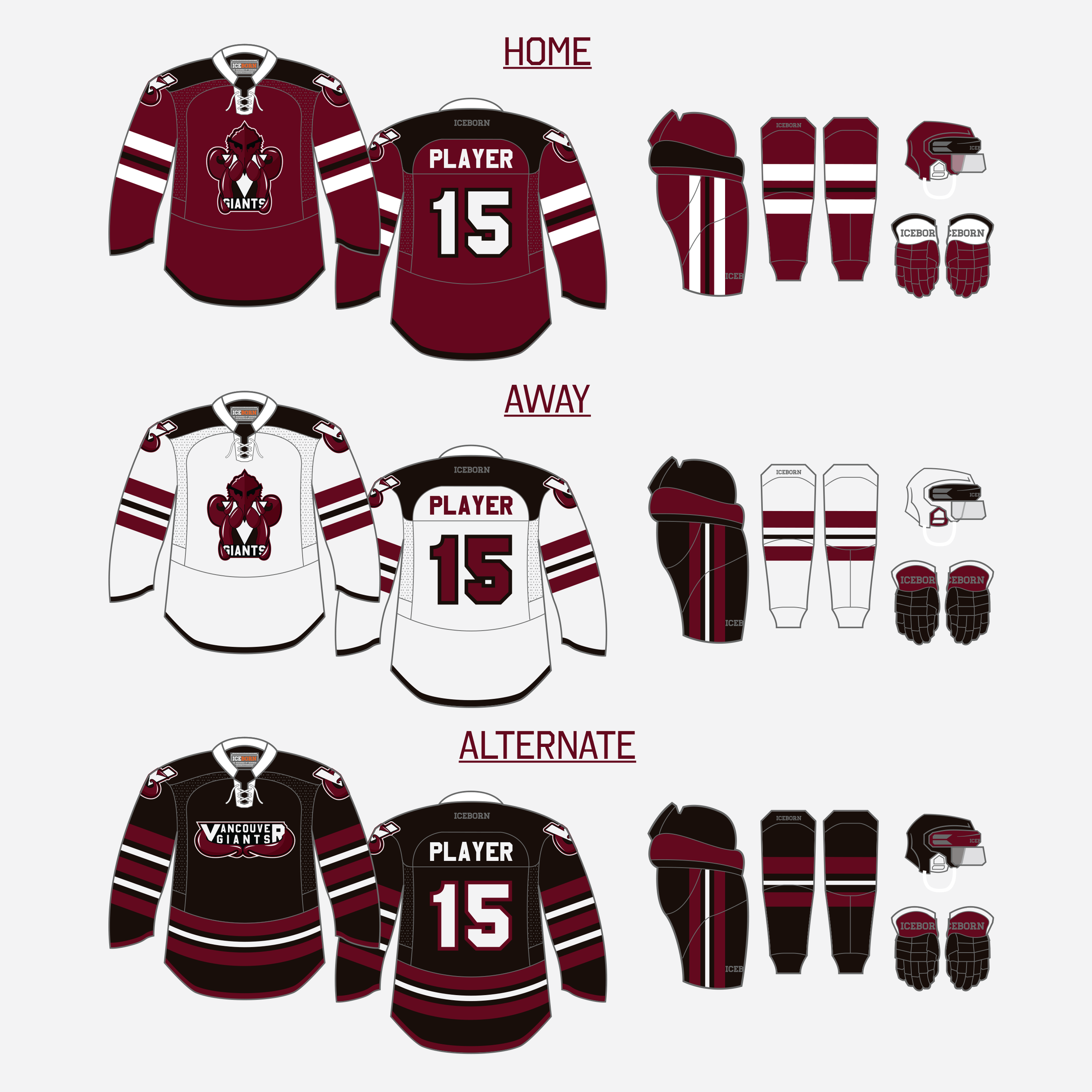
Vancouver Giants Rebrand is a reimagining of the Vancouver Giants brand. The logo, wordmark, shoulder patch, stationary, and web design were all changed. This reimagining was done to strengthen brand consistency, add a clean style to the web design, and link the brand to the roots of Vancouver hockey. Each tentacle of the kraken represents a player on the ice, and the forehead of the kraken represents the top of the Marine Building. The V in the logo and team colours allude to the Vancouver Millionaires (Vancouver’s first and only professional championship team). All of these decisions were made to create a stronger link to the city of Vancouver and its hockey history.